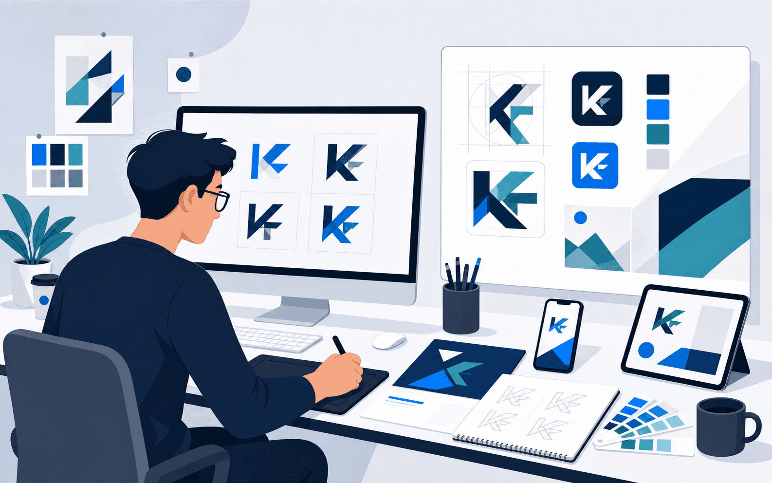
Overview
Not every engagement iEncode Tech takes on is a software build. KF needed a visual mark capable of representing the brand clearly across genuinely different contexts, a small app icon, a printed document, signage, without a full brand-guidelines system to enforce consistency behind it. The work began with the brand itself rather than a predetermined decorative style, treating the logo as a functional identity tool that had to hold up in real use, not a piece of standalone artwork judged only inside a polished presentation deck. This case study is worth reading precisely because it shows the same design discipline iEncode Tech applies to a product interface, applied instead to a much smaller, more constrained deliverable.
Where the brand started
Within iEncode Tech's branding and identity design work, KF approached the engagement without an established visual identity capable of representing it consistently across the places it actually needed to appear. That is a common starting point for a growing brand, and it carries a specific risk: without a considered process, the fastest path to a logo is often a decorative sketch chosen on personal preference rather than on how it will actually perform once it is small, printed, embroidered, or placed next to a competitor's mark. KF's brief was scoped as a focused identity engagement, brand discovery, logo concept development, and preparation for consistent application, rather than a full guidelines or collateral programme.
The core challenge
A focused identity engagement still has to resolve real design tension, even at a smaller scope than a full brand system:
- The mark needed to be recognisable without relying on decorative complexity that would break down once reduced to a small size
- A logo has to work across genuinely different contexts, screens, print, and signage, without a full guidelines document available to enforce consistency across every use
- Concepts needed to be judged as identity tools rather than isolated illustrations, which meant testing them against likely real-world use rather than a presentation slide alone
- The scope of the engagement had to be represented honestly to KF and, later, in any account of the work, without implying a larger deliverable set, a complete guidelines system or collateral suite, that was never part of the confirmed brief
Discovery and what the brand needed to say
Design exploration began with brand discovery, understanding how KF needed to be perceived, before any mark was sketched. That ordering matters: starting from generic logo tropes and working backward toward meaning tends to produce a mark that looks pleasant but says nothing specific about the brand it represents. The goal set at this stage was narrow but concrete: arrive at a mark that reads clearly at a glance, holds up at small sizes, and gives KF something distinctive enough to build further brand work on later, even though that further work was not part of this engagement.
Strategy and creative direction
With that understanding in place, multiple logo concepts were developed and reviewed specifically for how they would perform as an identity tool rather than as illustrations, legibility at small sizes, distinctiveness against likely competitors, and how well the mark would hold up once removed from a polished mockup and placed on an actual product or document. Restraint was treated as a design strength throughout rather than a limitation: a mark earns its impact by being confident in a small amount of visual information, not by adding detail until it looks finished.
Refinement and presentation
Refinement concentrated on proportion, clarity, and professional presentation rather than adding further decorative elements. Concepts were tested against practical use cases throughout development, not only at final sign-off, catching legibility or proportion issues while there was still room to adjust the direction rather than after a decision had effectively been locked in. The selected direction was then prepared specifically for adaptable application, keeping the contexts where KF would realistically use the mark, small digital placements, printed materials, signage, as a practical design requirement guiding the refinement rather than an afterthought addressed once the "real" design work was finished.
Tools and craft
Adobe Photoshop supported detailed concept rendering and refinement, giving the design team precise control over proportion and spacing as logo concepts were developed and tightened. Figma made it possible to share concepts, gather feedback, and iterate on the selected direction in a workspace both the design team and KF could access directly, without exchanging files back and forth for every round of feedback. This was a visual-design engagement rather than a software build, so no application technology stack applies beyond this design tooling; the relevant capability is design craft and process rather than engineering.
Where the work got difficult
The genuine difficulty in a small-scope identity engagement is not technical, it is disciplinary: resisting the pull toward adding just one more decorative element once a concept already looks good in a presentation file. A mark that looks distinctive at presentation size can fail completely once reduced to a favicon or embroidered onto a uniform, and that failure only shows up if someone deliberately tests for it. iEncode Tech addressed this by testing concepts against practical use cases throughout development rather than only at sign-off, and by treating every refinement decision as a trade against legibility at small sizes, not just visual appeal at large ones.
Results and impact
KF received a logo and supporting visual identity with a clear direction for consistent use, giving the brand a professional starting point it did not have before the engagement. The mark was designed to remain legible and recognisable at practical sizes, on a small screen, on signage, on a printed document, rather than only in an idealised presentation format.
The supplied information does not confirm a complete guidelines document, collateral suite, or colour rationale beyond the logo and visual-direction work described here, so those items are intentionally left outside this case study rather than implied. What is confirmed is a considered process, brand understanding, concept development, and refinement for real-world use, applied to a focused, honestly scoped brief.
What this project reinforced
Good identity work and good product design share the same underlying discipline: understand the thing before styling it, and test decisions against real use rather than an idealised presentation. That is the same approach iEncode Tech brings to UI/UX design work on larger software engagements, and it shows that the studio's brand identity capability extends to focused design briefs, not only full software builds such as the SewaMart or ZeroIQ engagements, which combined identity work with the products it now represents.
Need a visual identity that holds up in real use, not just in a presentation deck? Get in touch with iEncode Tech to discuss a focused brand or logo engagement, or see the KF project overview for a concise summary of the delivered work.